COLOUR TREND UPDATE FOR SPRING/SUMMER 2022
Happily, sustainability is also becoming more relevant when it comes to colour trends. Nowadays, the fashion industry turns its focus not only toward selecting new colours but also toward using nuances from previous seasons that are distinct and purposeful. This year’s spring and summer colours combine the need for something new with the charm of the familiar in shades that convey calm, comfort and optimism.
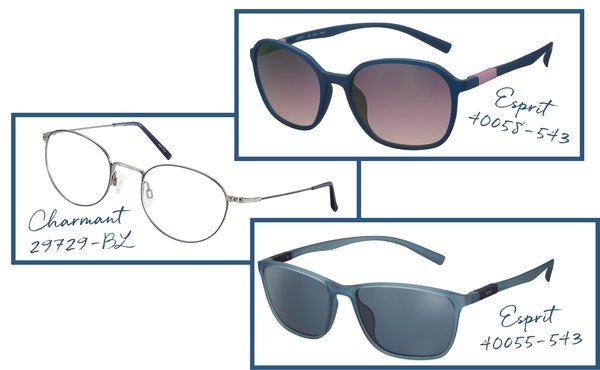
Discover these exciting new season colours and how we incorporate them into our eyewear collections.
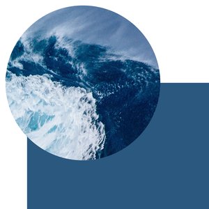
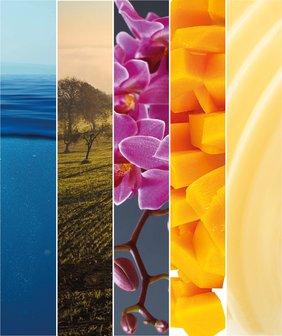
ATLANTIC OCEAN
When you think of the Atlantic Ocean, what colour comes to mind? That exact shade is one of the hottest this season. Blue is always reliable and flattering, which is probably one of the reasons why it's one of the world’s most popular colours. This special Atlantic Blue looks striking and conveys the calming effect of the sea.
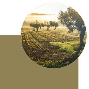
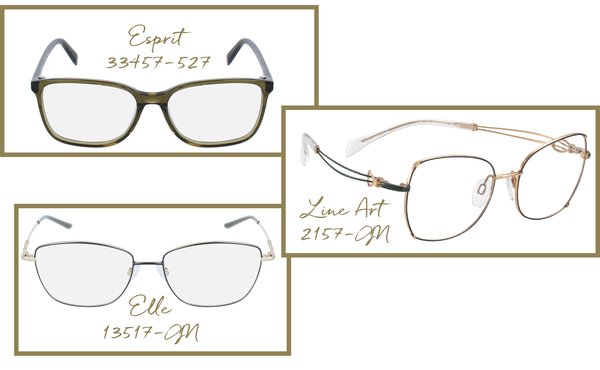
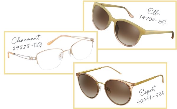
OLIVE OIL
Thanks to its close association with nature, green remains one of the most influential colours and we encounter it in all areas. This green shade of the season is inspired by the warm tones of olive oil.
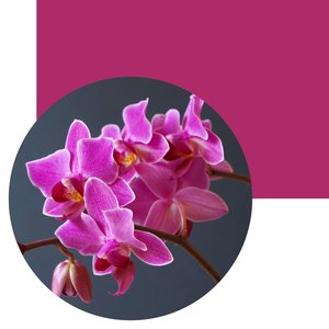
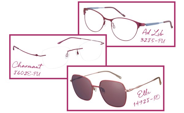
ORCHID FLOWER
When we speak of strong and cheerful colours, there is no getting around this one: pink! This season's pink is inspired by the beautiful petals of the orchid. It is difficult to escape the power and positivity of this joyful hue.
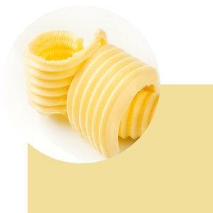
SOFT LIKE BUTTER
Coming from the family of pastel colours, a light and creamy newcomer has emerged that can best be compared to the colour of delicate butter. This on-trend shade exudes a soft and smart aesthetic that is enchanting.
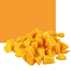
MANGO
Mango is not only enjoyable on the dessert plate, now it’s a colour to savour while wearing! This fruity orange tone shouts optimism and joyful exuberance.
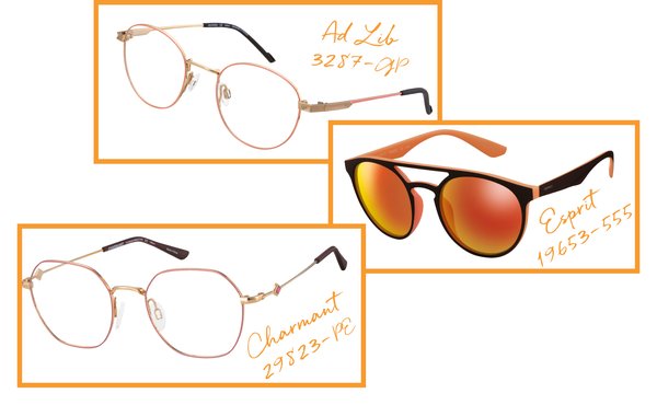

PANTONE COLOUR OF THE YEAR 2022
Every year, the colour experts at the Pantone Color Institute choose the colour of the year and look out for new colour influences from around the world. The institute justifies the selection of the Pantone colour 2022 as follows:
“We are living in transformative times. PANTONE 17-3938 Very Peri is a symbol of the global zeitgeist of the moment and the transition we are going through. As we emerge from an intense period of isolation, our notions and standards are changing, and our physical and digital lives have merged in new ways.
Digital design helps us to stretch the limits of reality, opening the door to a dynamic virtual world where we can explore and create new colour possibilities. With trends in gaming, the expanding popularity of the metaverse and rising artistic community in the digital space PANTONE 17-3938 Very Peri illustrates the fusion of modern life and how colour trends in the digital world are being manifested in the physical world and vice versa.”
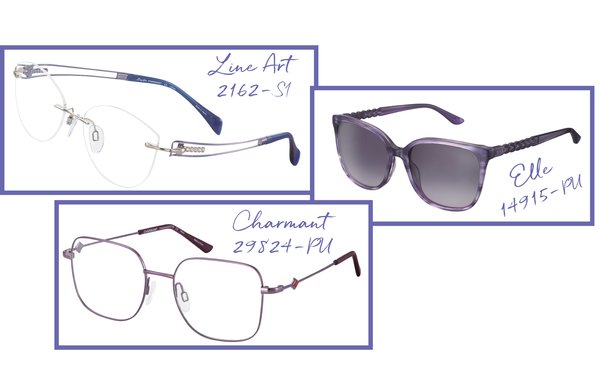
Of course, the Pantone colour of the year also plays a role in our glasses collections.
Finally, in the interests of sustainability, when choosing new glasses frames, we suggest you select a colour that you will still enjoy wearing in a few years. After all, ideally, your glasses will accompany you for a long time.
Picture source: Pixabay & Shutterstock